Table of Contents
Choosing the right fonts for your equestrian brand matters more than most people realize. Typography sets the tone for how your business is seen by potential clients before they read a single word.
The right font choices will match your brand’s style without being too generic, help push your brand’s voice + messaging, and ultimately speak directly to your ideal client. But picking the right combo? Ridiculously overwhelming.
The sheer number of fonts available online can make it really hard to pick (and stick with) a single combination. To make your life a little easier, I’ve curated a list of 10 free font that work beautifully for your equestrian branding.
Save this post for later
If you’re building (or refreshing) your brand and want solid typography options – save this post on Pinterest to find it again when you need it!
The Vibe: simple + Timeless
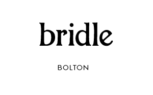
Bolton is one of my go-to fonts for equestrian brands that want a simple and timeless vibe. It’s clean and elegant without being cold or stuffy.
It’s best for high end barns, trainers, or service based equine businesses that are targeting a more traditional or luxury audience.
Design Tip
Bolton will look the best when paired with a sans-serif body text so your brand will feel balanced + relatable.
The Vibe: Modern + laid Back
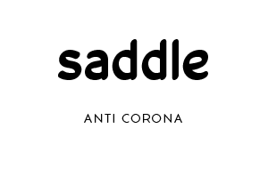
Don’t judge a font by it’s name! Anti Corona is a pretty sans-serif font that brings a modern and laid back vibe. It’s got just enough character to keep it from being too generic (which we love).
I’d probably recommend this font for modern businesses or western-inspired brands that want something fresh and unfussy.
Design Tip
You can use Anti Corona as a heading or your body text. If you want some fun contrast, use it as your body text with a low key serif font like Fragment Core Roman.
The Vibe: Ethereal + Trendy
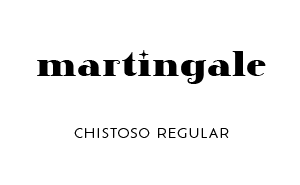
If your goal is to create a brand that makes a statement, you’ll love Chistoso Regular. It has all the elements that you’d want in an ethereal style font (including the fancy sparkle i’s). I imagine this font would work well for an equine bodywork pro or a natural horsemanship business.
Design Tip
This font works well for logos or main headings, but you should avoid using it as body text or for any elements that need long paragraphs. It’s trend-forward, which means you should use it sparingly.
The Vibe: Funky + Modern
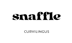
If you’re a fan of funky, mid-century modern serif fonts, you’re gonna love the Curvilingus font (especially if you can get past the name). I love this font because it’s pretty, functional, and unique.
Any equestrian brand that caters to a younger, modern audience will love this font option.
Design Tip
Curvilingus can work as a heading or body text, but I think it deserves to be the star of the show. Keep it as a main heading and pick a softer font to complement it.
The Vibe: Nostalgic + Fun
One of my favorite things about typewriter fonts like this one is how fun it feels to type with them. It feels very nostalgic. Although, to be completely honest, I’ve never actually used a typewriter. So I guess you could say it’s what I IMAGINE to feel very nostalgic.
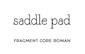
Fragment Core Roman is a fantastic choice for a brand that’s traditional with a twist. In my opinion, typewriter fonts rarely go out of fashion – especially when they’re as pretty as this one.
Design Tip
Because this font is thin and dainty, I’d suggest keeping it as a heading. Use it with a similar weight sans-serif font for a body text, and you’ll get a stunning, dainty vibe.
The Vibe: Glamorous + Classic
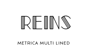
I get some serious Great Gatsby vibes off of Metrica Multi Lined. You see it too, right? Talk about glamour! I imagine this font to be a perfect fit for an equine photographer with a glamorous side (and set of clients).
Design Tip
As with any statement font, I’d advise you to pair this one with a more subtle serif font so you don’t overwhelm your logo design. Or website, for that matter.
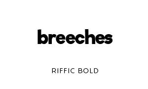
The Vibe: Modern + geometric
This font is just pure fun, and you really can’t go wrong with a classic sans-serif like this one.
This font option is perfect for veterinary clinics or bodyworkers who want to lean into the modern, science feel.
Design Tip
Keep your text lowercase for the approachable vibe, or switch to all-caps to give it some luxe vibes.
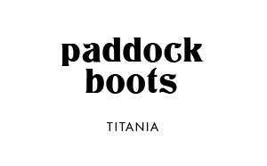
The Vibe: Elegant + Subtle
Talk about stunning – Titania gives me all the feels. I know you’re not supposed to be this obsessed with a font face, but I absolutely am. The subtle curves throughout the letters are so pretty.
Design Tip
Because of the fancy swishes throughout the font, this is definitely more suited to being a heading type. Keep it simple and let it shine!
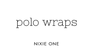
The Vibe: Western + Casual
Nixie One is another typewriter font that comes off a little less traditional. This one is a little more of a combination between fancy serif and old timey typewriter, if you know what I mean. And if you don’t, no worries – just know that it’s a pretty font!
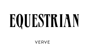
The Vibe: Modern + high End
Verve may be my favorite font on this entire list, which is why I saved it for last. While not a great fit for everyone, I think this font would be stunning when used appropriately. I imagine this one to work well for a high end riding club in Los Angeles or Ocala.
It could also work well for a media company or equestrian magazine. So many ideas!
Download Free Fonts for Your Equestrian Branding Project
By now, you’ve probably noticed something important: fonts don’t just “look pretty” – they shape how potential clients see your equine business.
If you’re enjoying experimenting with typography, this list should give you a strong starting point. And if you’re realizing you’d rather skip the trial-and-error phase altogether, that’s completely normal.
👉 If you want your fonts, logo, and visuals to already be done for you, explore my equestrian brand kits. They’re designed specifically for horse businesses that want a professional, cohesive look without custom design timelines.
👉 Or browse the full shop for workbooks, templates, and tools to support your brand at every stage.
