If you’re looking to create (or redesign) your equine business logo, you’re probably scrolling through inspo, comparing options, and trying to figure out what actually works. So let’s skip straight to that: what makes a equine logo stand out in the equestrian industry, and what does that actually look like in practice?
Here are a few of my client logos with a real breakdown of why they work, plus what you can use to guide your own design.
What Makes an Equine Logo Actually Work?
Before we dive into the examples, let’s get clear on what separates a forgettable horse logo from a brand mark your clients will instantly recognize:
- Versatility: Will it look amazing everywhere you need to put it? Think social media profiles, your website, business cards, and cute sweatshirts or tack trunks.
- Memorability: Does it have something unique that will stick in the mind of your dream buyer?
- Relevance: Does it resonate with your specific equestrian audience? (A tack store won’t benefit from the same logo as a hunter jumper barn)
- Simplicity: Can someone easily picture it in their minds, or does it have so many different fonts and colors that it literally gives them a headache?
- Authenticity: Does it actually reflect what makes your business special?
- Uniqueness: Did you use the same exact jumping horse silhouette or horse head that everyone and their cousin has?
Let’s look at 4 logos that nail these principles.
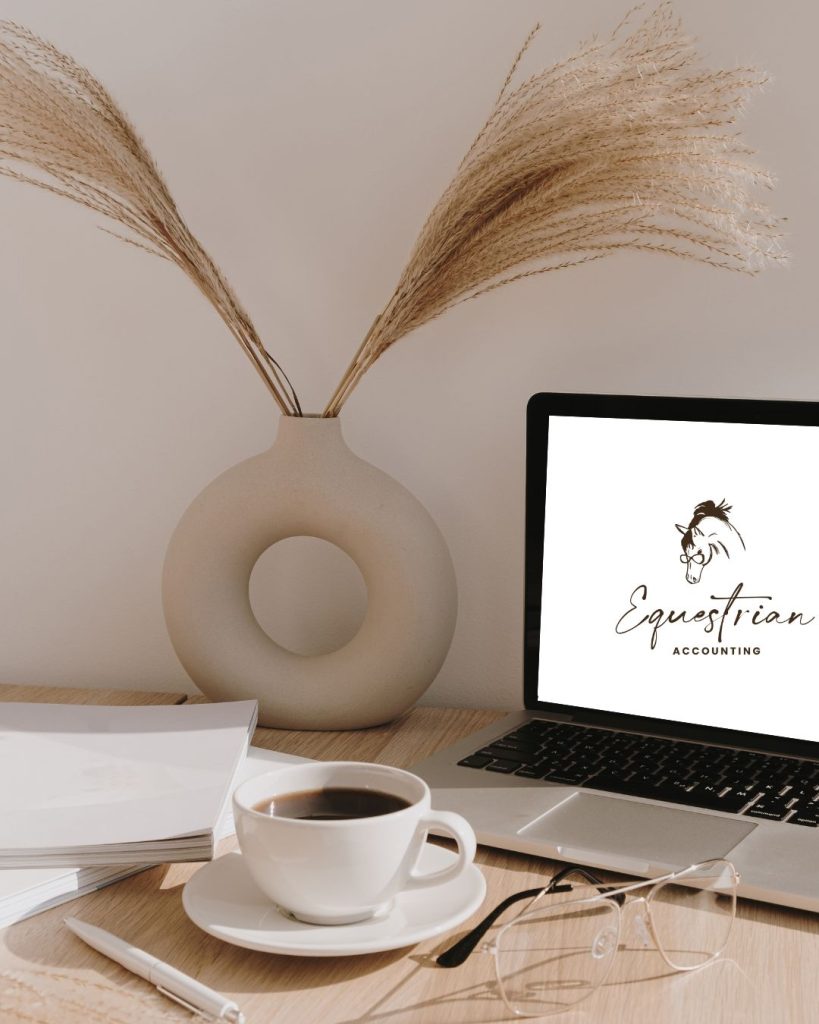
1. Equestrian Accounting
Why it Works
This logo shows you how elegant simplicity can elevate an equestrian brand (without being too uptight). The clean, minimalist horse head sketch paired with sophisticated typography creates:
- A professional, but fun impression that builds trust with financial clients
- A design that works beautifully in black and white (essential for documents) AND color
- An equestrian reference that feels fun and industry-specific, not cliché (because how cute is a horse with glasses?)
What makes this work is the balance between the expressive, artistic line work of the horse and the structured, clean typography—mirroring how the business brings creativity to a traditionally structured field.
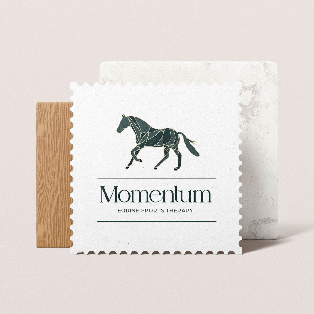
2. Momentum Equine Sports Therapy
Why it Works
Why it works: Another design from my portfolio, this logo for an equine bodywork business leverages geometric shapes to convey both movement and precision:
- The geometric horse illustration suggests anatomical knowledge and technical expertise
- The stamp-like border creates a quality seal effect that builds trust
- The clean typography balances the detailed illustration
This design works because it communicates the essence of Sadie’s business – methodical, precise care – while still maintaining an artful quality. The gold line details on the dark horse silhouette suggest premium service without being flashy.
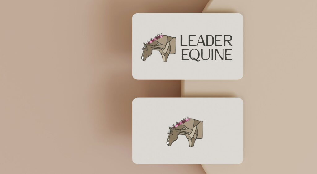
3. Leader Equine
Why it Works
Why it works: For this client, I created a logo that balances geometric precision with natural elements:
- The angular horse design communicates leadership and forward thinking, while remaining instantly recognizable
- The strategic floral accent adds a distinctive touch without compromising the professional tone
- The earth-toned color palette with magenta accents creates visual hierarchy and memorability
- The typography is confidently spaced and proportioned, complementing rather than competing with the mark
This logo works because it sidesteps the industry’s tendency toward traditional, literal horse imagery. Instead, it delivers a mark that functions beautifully across applications—from tote bags to digital platforms—while maintaining its character.
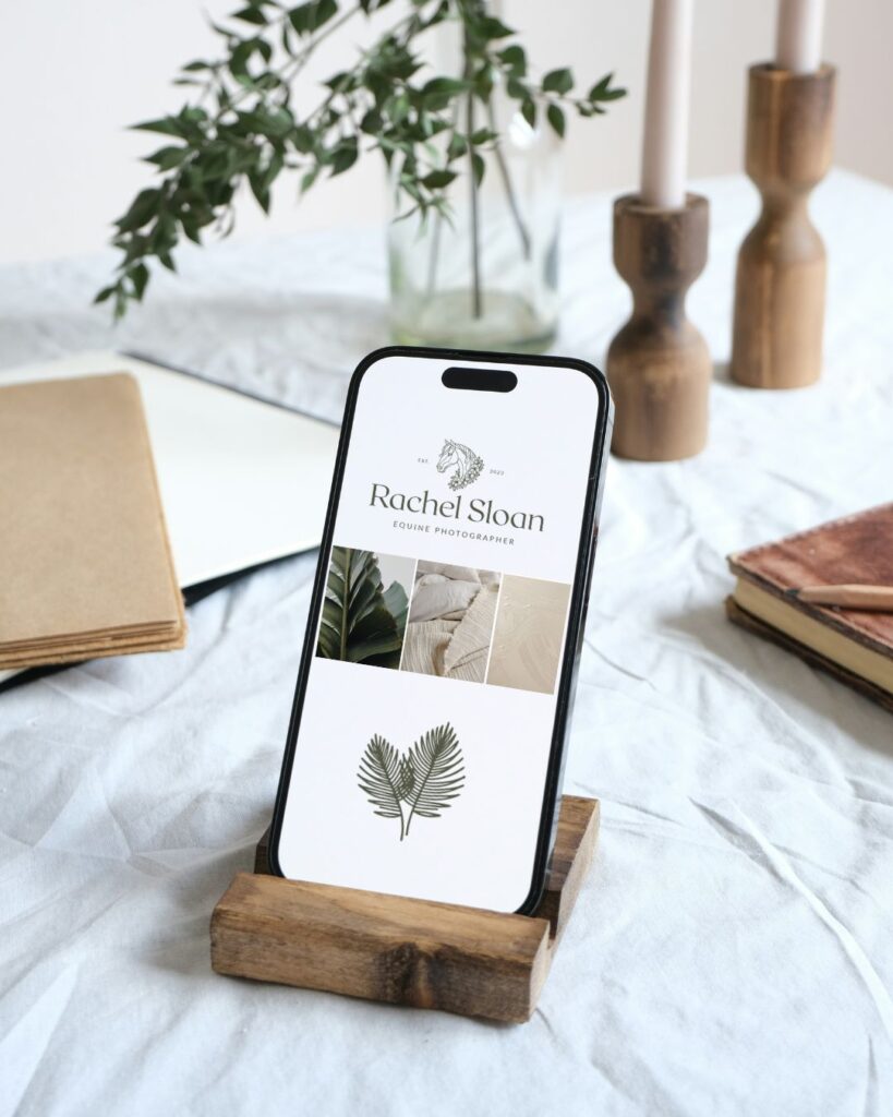
4. Rachel Sloan Photo
Why it Works
This photography brand required a logo that would complement beautiful equine imagery without competing with it:
- The delicate line art horse creates an elegant frame for Rachel’s name
- The unique typography adds credibility and timelessness
- The island-inspired elements add a distinctive touch that pay respects to Rachel’s Hawaiian location
This horse logo creates a consistent visual language across all brand touch points while remaining understated enough to let the photography itself shine.
WAnt to see more equine logo examples?
Pop over to my design portfolio (or my Pinterest account) to see more designs.
What These Logos Can Teach Your Equestrian Business
Budget constraints are real, especially when you’re just starting out. But your logo isn’t the place to cut corners. It’s literally the face of your business. Here’s what we can learn from these examples:
- Ditch the generic horse silhouette. Find something unique about your business and express it visually.
- Think about application from day one. Will your logo work on embroidered barn jackets? Business cards? Instagram profile pics? Design with versatility in mind.
- Balance tradition with modernity. The most successful equestrian brands honor the industry’s heritage while incorporating contemporary design elements.
- Simplify, simplify, simplify. The logos that stand the test of time are almost always the simplest ones. If you can’t draw it from memory, it’s probably too complicated.
- Match your brand position. A logo for a high-end dressage trainer should feel different from one for a western riding instructor or a tack shop. Know your place in the market.
Is Your Equestrian Logo Working As Hard As You Are?
Let’s be honest—you pour your heart and soul into your equestrian business. You get up before dawn, work weekends, and probably haven’t taken a real vacation in years. Shouldn’t your branding work just as hard?
If you’re ready to elevate your equestrian business with branding that attracts your dream clients and sets you apart from the sea of generic horse logos, I’d love to chat about creating a distinctive visual identity that’s as exceptional as the services you provide.