I get asked this question all the time: “What fonts should I use for my equestrian business?”
You can google it for yourself right now, and you’ll see and endless list of blog posts + suggestions (most of which will tell you to “pick an elegant serif” or “go clean and modern”). But here’s what I’ve learned after working with dozens of equine businesses: your font choice should be based on your dream client – not what you like or are drawn to.
Here’s the thing about fonts: they’re not neutral. They signal something. And if they’re signaling the wrong thing to the wrong person, it doesn’t matter how beautiful they are.
So instead of giving you a generic listicle, I’m going to show you font pairings—and then I’m going to tell you exactly what kind of business owner I think should be using them. Because if the font fits your dream buyer, it’ll actually work.
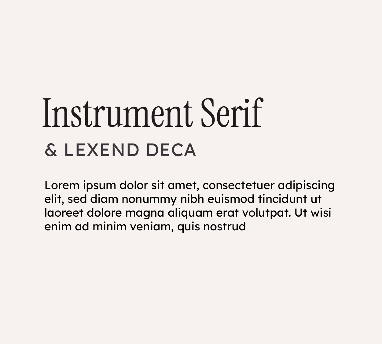
Contemporary professional. High legibility without coldness. This reads “I know what I do and I do it well” without being stuffy or trying too hard.
Who this works for: Premium trainers, specialized bodyworkers, advanced therapy practices. Anyone charging what they deserve and attracting buyers who see your work as an investment, not a commodity.
Who this doesn’t work for: Someone just starting out or trying to seem more established than they actually are. The fonts will feel like you’re overselling yourself.
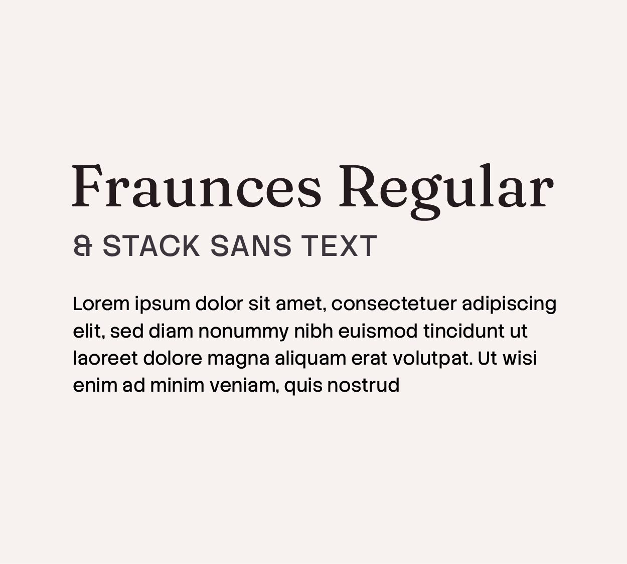
Refined with quiet confidence. Fraunces has elegance and character without being fussy. Stack Sans Text is clean and modern. Together they feel like someone who knows their craft and doesn’t need to oversell it.
Who this works for: Boutique boarding facilities, high-end therapy practices, anyone whose dream buyer sees what you do as a luxury. People with an established reputation who want their visual branding to match.
Who this doesn’t work for: Service-based trainers competing on volume or accessibility. These fonts can create distance from people who need to feel like you’re approachable.
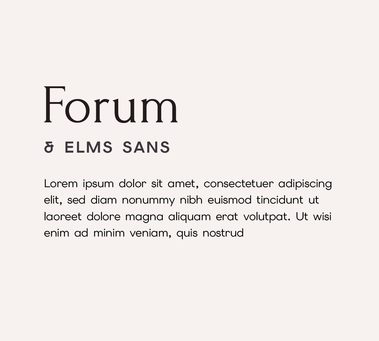
Strong and grounded. Forum has weight and character. Elms Sans is clean and readable. This feels established and confident—like someone who’s been doing this work and has people who know their name.
Who this works for: Trainers with a following, established vets, anyone whose reputation is already doing the work for them. Businesses built on word-of-mouth and trust.
Who this doesn’t work for: New businesses or anyone still building credibility. This combo assumes you’ve already proven yourself.
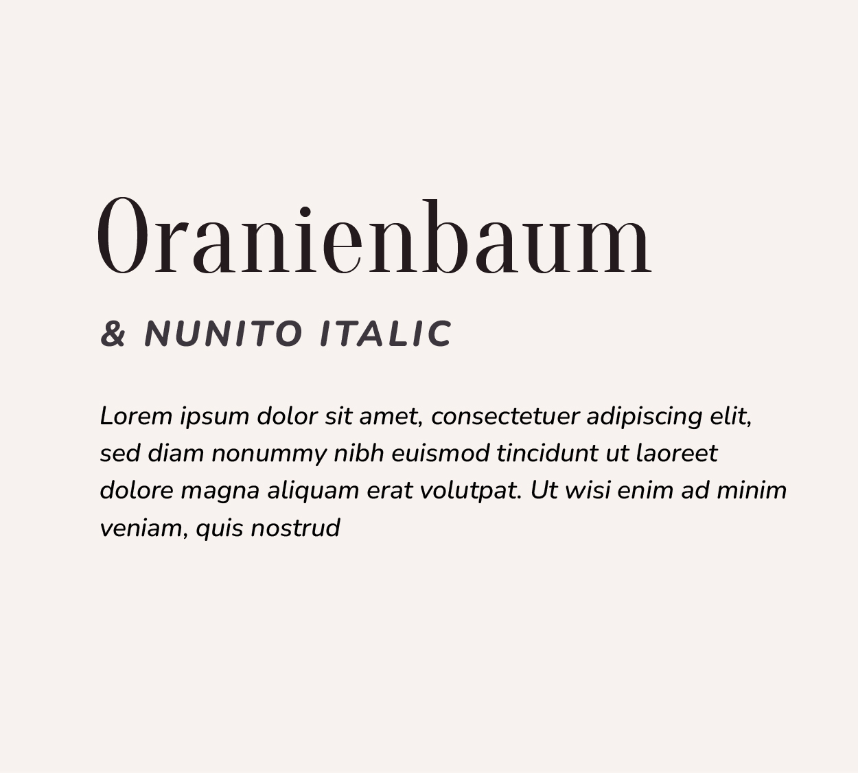
Playful but legible. Oranienbaum is decorative without being fussy. Nunito is friendly and clear. This feels like someone who knows how to welcome people.
Who this works for: Education-first trainers, clinicians, anyone whose dream buyer shows up because they want to learn. Trainers who teach clinics and workshops. People whose business model relies on making their material accessible.
Who this doesn’t work for: Luxury positioning or ultra-premium pricing. These fonts can read as more approachable than exclusive, which might undersell your work if that’s your market.
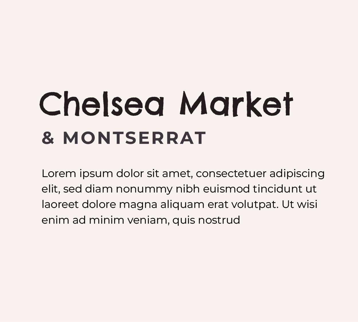
Bold and genuinely memorable. Chelsea Market is distinctive—people will remember you. Montserrat is confident and strong. Together they feel like someone with a clear vision and point of view.
Who this works for: Trainers known for their approach or philosophy. Tack shops with a specific aesthetic or mission. Anyone whose dream buyer is drawn to personality and perspective, not just competence.
Who this doesn’t work for: Generic service positioning. These fonts are risky if your brand isn’t backed up by something distinctive. They can feel trendy on their own.
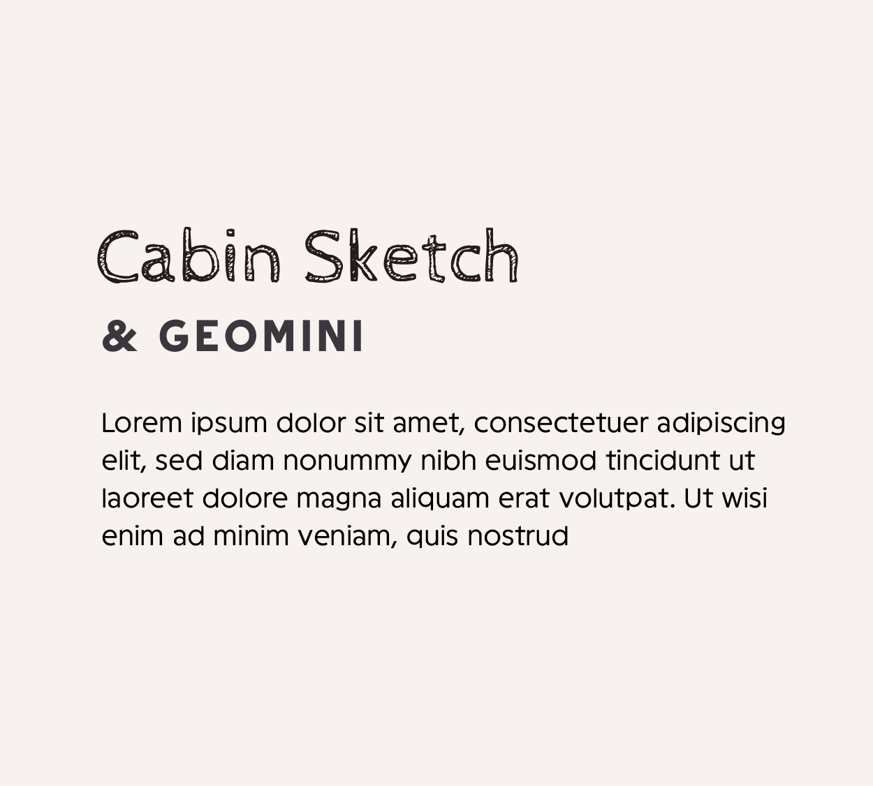
Playful and geometric. Cabin Sketch has warmth and texture. Geomini is modern and clean. This feels creative and thoughtful—good for someone building something different.
Who this works for: Trainers positioning as innovative or non-traditional. People whose dream buyer is younger or values new approaches. Anyone whose business model breaks the mold.
Who this doesn’t work for: Traditional or heritage-based businesses. Bodywork practices positioned on classical knowledge. These fonts can feel too trendy if your value proposition is rooted in proven methods.
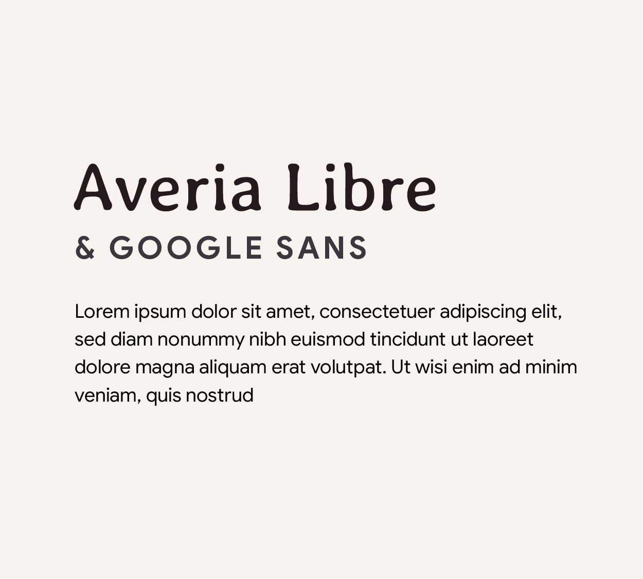
Friendly and modern. Averia Libre feels human and warm. Google Sans is crisp and clear. This works for someone emphasizing accessibility without sacrificing polish.
Who this works for: Remote coaches, online educators, trainers whose dream buyer values efficiency and clarity. Anyone doing digital-first work or emphasizing learning over luxury.
Who this doesn’t work for: Ultra-premium positioning or heritage services. These fonts can read as too casual for high-end boutique work.
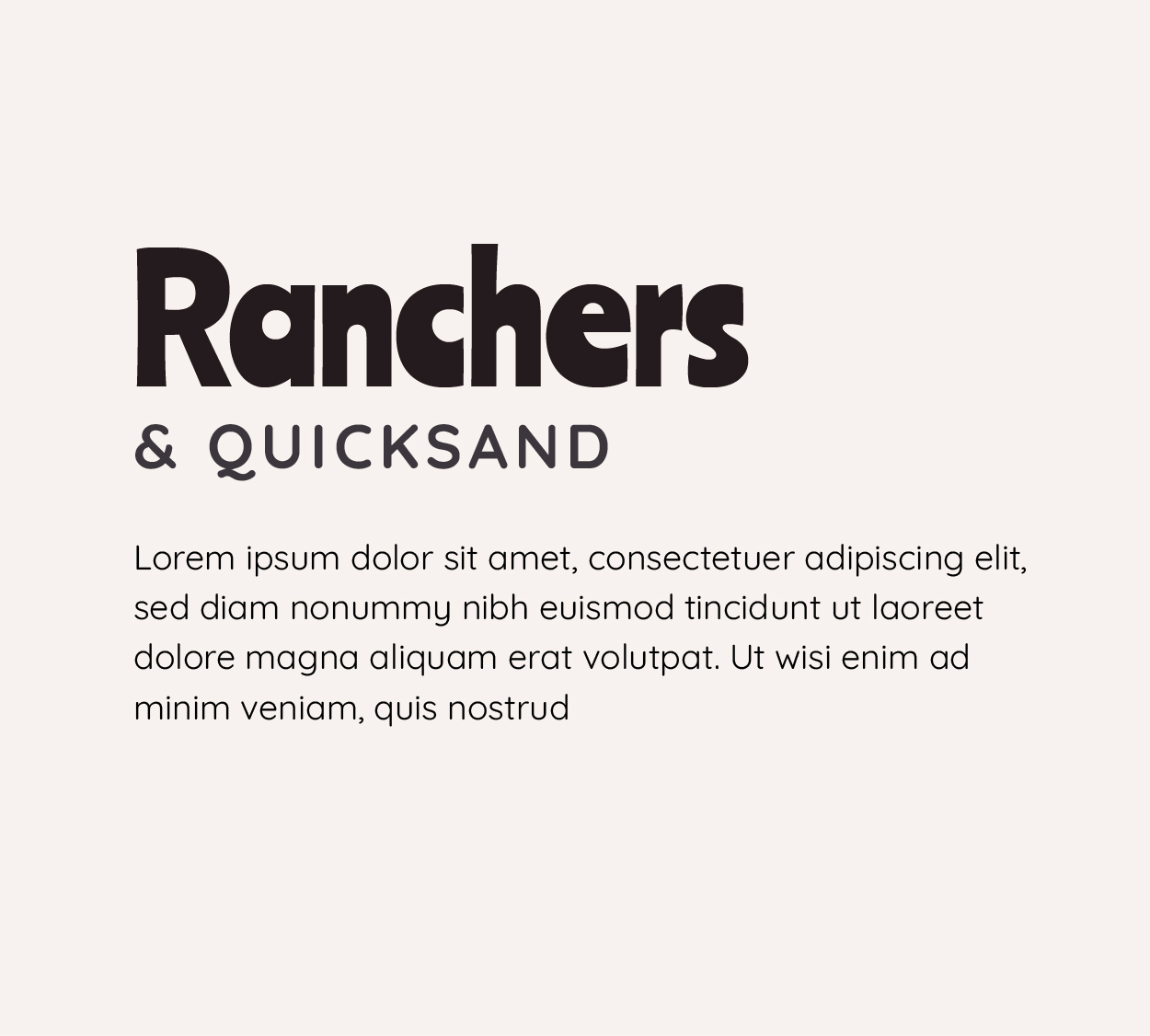
Casual and confident. Ranchers has western personality and warmth. Quicksand is friendly and rounded. This feels no-nonsense and relatable.
Who this works for: Trainers in rural or western markets. Anyone whose dream buyer wants someone practical, not fancy. Businesses emphasizing real-world application over theory.
Who this doesn’t work for: Luxury services or ultra-refined positioning. This combo can feel too informal if your market expects sophistication.
Warm and approachable without being cutesy. Lobster has personality. Elms Sans keeps it grounded. This works for someone with a strong personality who still needs to feel professional.
Who this works for: Trainers known for their teaching style or energy. Service-based coaches. Anyone whose dream buyer is drawn to personality and warmth alongside competence.
Who this doesn’t work for: Ultra-formal or luxury positioning. If your dream buyer expects restraint and formality, this combo reads as too casual.
Notice how I didn’t just say “use this font because it’s pretty”? Each pairing serves a specific kind of buyer and a specific kind of business model.
The font choice isn’t really about aesthetics. It’s about alignment.
If your fonts are signaling the wrong thing to the wrong person, you’ll get inquiries from people who don’t fit. You’ll wonder why nobody feels right. You’ll end up managing expectations constantly instead of working with people who get what you do.
The fonts I use aren’t my favorite fonts. They’re the fonts that tell the person I want to work with, “Yes, this is for you.”