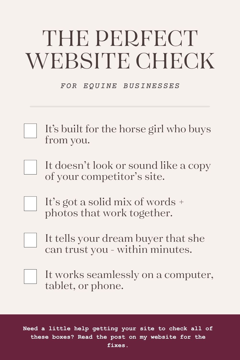
If I had a dollar for every equine business website I’ve reviewed, I could probably retire my entire client list. And after seeing hundreds of them, I’ve noticed that the same mistakes come up over and over again.
You know what most of them have in common? They were built for the person who made them, not the person who’s supposed to use them.
Templates make it easy to get something live quickly, but they also make it easy to copy a structure without thinking about whether it actually works for your visitor. And most people don’t realize that until they’re wondering why nobody’s filling out their contact form.
If you want the top five things I see holding equine business websites back, here’s what they are.
A website that’s built for your visitor takes into consideration the information she wants to know, how she wants to hear it, and how quickly (and where) she wants to see it. Let me give you an example of what it looks like when it’s done wrong.
Last year I was looking for a PEMF provider near me in the Portland area. It should have been a 5 minute search from start to finish, but it turned into a frustrating rabbit hole. And when I finally found someone, I STILL couldn’t tell whether she’d travel out to Newberg or not. I reached out anyway because it was my only option, but I shouldn’t have had to work that hard to give someone my money.
If that website had been built for me, it would have been crystal clear within the first 5 seconds on Google: where she was located, what areas she traveled to, and any travel fees. When I clicked through, I’d get a clear look at her services and pricing, and a button right there to call or send a message. Done. Easy. Next step obvious.
The same goes for your words. How many times have you landed on a website and read something that went completely over your head because it just wasn’t written for you? Didn’t exactly make you want to buy, right? When your words are written in terms your client actually understands, she connects with them and she’s a whole lot more likely to reach out.
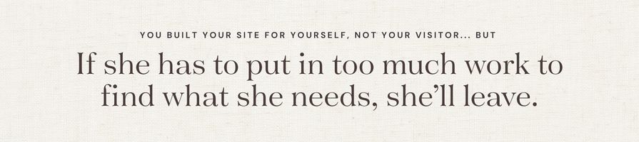
Your website is usually one of the first things a potential client sees. If she has to put in too much work to find what she needs, or doesn’t connect with what she reads, she’ll leave. And you’ll end up with one less inquiry – all because she wasn’t the one you were thinking about when you built it.
When I land on a website and the copy feels like everyone else’s, I immediately default to comparing prices. Because if there’s nothing differentiating you from the next person, the only thing left to evaluate is cost. And I’m probably going to pick the lowest option, which means the most talented person in the bunch might lose the job just because her words didn’t show me why she was worth more.
Here’s what I mean. I did a quick search for equine photographers and pulled the first line of copy from the top three results:
“Joyful, vibrant, and authentic storytelling that celebrates the extraordinary connection humans share with horses.”
“I aim to capture photographs that don’t just look good — they feel good.”
“Specializing in equines, equestrian sport, and telling a story.”
None of those are bad. But you could swap the names between all three websites and nobody would know the difference. That’s the problem. If your words could belong to anyone, they’re not doing their job.
And then there’s AI. I know everyone’s using it, and that’s fine. Using it as a tool is smart. But using it as a replacement for your own brain is lazy, and your potential clients can tell. AI content is either completely devoid of emotion or has so much fake personality that it overshoots in the other direction. Either way, it’s a missed opportunity. Your client could be landing on the website of someone she’d absolutely adore, but if there’s no glimpse of the real person behind it, she’ll never know.
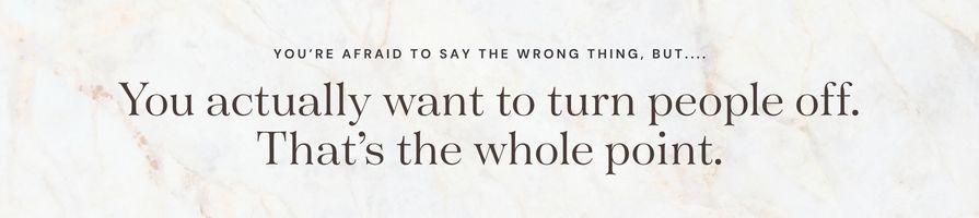
Here’s what I want you to know about generic, safe copy: a lot of business owners go that route because they don’t want to turn anyone off. But you actually do want to turn people off. That’s the whole point. You don’t want a business full of whoever. The right words will filter out the people who aren’t a good fit just as clearly as they attract the ones who are. Your website should work both ways.
There’s this belief floating around that nobody reads anymore. And it’s leading a lot of equine business owners to let their photos do all of the talking. But photos without context aren’t actually saying a whole lot. And more often than not, the photos aren’t doing the heavy lifting you think they are.
A stock photo of a horse in a field next to the description of your PEMF package isn’t telling your visitor anything meaningful.
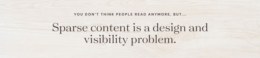
But here’s the part that you’re probably not thinking about: sparse content is a visibility problem. Search engines (and AI) crawl the text on your site to figure out what you do and who to show you to. If your competitor’s website has more context than yours, it’s going to show up first. Which means that your potential client might not even make it to your website in the first place.
And while people are visual, that doesn’t mean we want a bunch of photos or videos thrown in our face without any context. We want information, we just want it served in a visually appealing way. There’s a huge difference between those two things.
I can already hear some of you saying, “but I’ve seen really beautiful, minimal websites that work great.” And you’re right! Those exist. But when you look closely at those sites, what do you actually see? A bunch of photos with one or two lines of text? Or a healthy mix of photos with intentional text displayed in a variety of complementing fonts and colors?
I’d guess that most of the minimal sites you admire aren’t minimal in the way you’re trying to implement it.
I can’t tell you how many times I’ve purchased something simply because of the person selling it. The product or service was probably similar to others I could have picked, but something about that person made me feel like I was in the right hands. But that feeling didn’t just happen because I liked their headshot. It’s because I was invested in their story.
A lot of equine businesses jump straight into what they’re selling without giving the visitor any sense of who is behind it. Others lead with an educational background or work history that reads more like a resume than a conversation (congrats on your MBA, but why does it relate to you selling your supplements?).
And then there’s the opposite extreme: the business owner who shares her entire life story, including her dogs, her kids, and her childhood memories without ever tying any of it back to the person reading it.
Neither of those approaches build trust. And here’s why that matters: your visitor is a stranger. She found you somewhere on the internet and landed on your site. Before she’s ready to hand over her money or trust you with her horse, she needs to feel like she knows you a little. And more importantly, that you understand her.
That doesn’t mean your background and credentials don’t matter. They absolutely do. But there’s a difference between listing them and connecting them. Something like: “I have a certificate in this bodywork course that helps me stay current on the latest modalities so I can help your horse feel rejuvenated even after an intense show week.” Or: “I became an equine vet because my childhood horse struggled with laminitis and I didn’t know how to help her. Now I get to make sure you never have to feel that helpless.”
See the difference? One is a resume. The other is a reason to choose you.
If you’re skipping your about section because you think your work speaks for itself… it might. But your story is what makes someone feel something. And people buy from people they feel something about.
And while people are visual, that doesn’t mean we want a bunch of photos or videos thrown in our face without any context. We want information, we just want it served in a visually appealing way. There’s a huge difference between those two things.
I can already hear some of you saying, “but I’ve seen really beautiful, minimal websites that work great.” And you’re right! Those exist. But when you look closely at those sites, what do you actually see? A bunch of photos with one or two lines of text? Or a healthy mix of photos with intentional text displayed in a variety of complementing fonts and colors?
I’d guess that most of the minimal sites you admire aren’t minimal in the way you’re trying to implement it.
Think about this for a second. Your client is standing in front of her horse and notices he’s a little stiff going to the left. Bodywork crosses her mind. She reaches for her phone to search. She finds your site… and can’t navigate it because the text is tiny, the spacing is off, and nothing is where it should be. So she moves on.
And it’s not just at home. Think about how much downtime there is at horse shows: in between classes, during hand walks, waiting for the farrier to tack on a thrown shoe. We’re scrolling. Your site needs to work on that device.
Most business owners end up with one of two mobile problems. Either everything just shrinks down from the desktop version, which means your visitor is pinching and zooming just to read a sentence. Or the site defaulted to a mobile layout that was never adjusted, leaving awkward spacing, text that’s too big in one place and too small in another, and a general feeling that something is just… off.
A lot of this happens because business owners don’t realize they have control over it. They build the site on desktop and assume it’ll translate. Or they do most of their own browsing on a computer, so they genuinely don’t know what their visitor is experiencing on a phone.
Here’s the fix: pull out your phone right now and navigate your own website as if you’re a potential client. Can you read it easily? Can you find the contact button without zooming in? Does it feel as intentional as the desktop version? If the answer to any of those is no, that’s where to start.
If you’re reading this and thinking about how many of these mistakes your own website is making – don’t freak out. They’re honestly really common, and you’re not a website designer. You don’t see and touch websites the way I do every day, so it’s fair that it wouldn’t be perfect.
And if we’re being real, most of these mistakes happen because you probably don’t know your visitor as well as you should. In order to create the best experience and give yourself the best chance at converting her, you want to know her like the back of your hand. The same way you know your best friend.
If that’s hitting a little close to home, grab a free preview of my Dream Buyer Blueprint. It’s a workbook that walks you through exactly who your dream buyer is and how to shift the way you market your business in order to attract her.